
Luxury Travel Advisor Website Design: What Makes It Work Well
Blog Overview: Luxury travel advisor website design: what's actually behind that 'this looks expensive' feeling, and what's working against your positioning without you realizing it. [About a 12-minute read.]
You may have been creeping around at another Travel Advisor's website and felt it. The thing where the page looks just right. It’s considered…as if actual strategic decisions were made. And then you've looked back at your own and thought: Is there something I'm missing, or is it just vibes?
It's not vibes.
There's a peer-reviewed study published in Behaviour and Information Technology that found that users form a visual impression of a website in approximately 50 milliseconds. First impressions are 94% design-related. That's before anyone reads your bio, your specialty, your fees, or a single testimonial. The judgment about whether your website feels credible is already made.
For a Travel Advisor asking someone to hand over thousands for a trip and trust that it'll all be handled exactly right, that first impression does more than any marketing email ever will.
This post is geared towards Travel Advisors affiliated with Virtuoso, Fora, or a premium host, who are booking FIT and high-budget travel, and whose website needs to reflect where the business actually is (or where you want to be headed), and what design decisions should be considered so your website is working for you, not against you.
What ‘High End’ Usually Means on a Website
It's not a colour palette or expensive photography. It's not even minimalism, though restraint is a big part of it.
High-end, on a website, means communicating selectivity. Your design and copy together signal that you work with a particular kind of client, that you know who that is, and that the wrong person will probably figure that out fairly quickly. Repelling clients is the name of the game.
That's the part most websites get backwards. In an attempt to appeal to anyone who might book a trip, they try to show everything: every destination, every type of traveller. The visual result is noise, and the positioning message it sends is that you'll take anyone.
What high-budget clients respond to is the opposite. Research on what high-net-worth clients look for when hiring a service provider is consistent: specificity over breadth signals authority in a way that trying to appeal to everyone never can. A homepage that makes one clear case for one type of client says you know who you work with and you've chosen that work deliberately. The restraint is the point. What you choose not to include is as deliberate as what you do.
Here’s a round up of what to consider when designing for a ‘high end’ website vibe.
1) Typography - The Detail Does More Work Than You Think
Typography (often referred to as fonts) is consistently the most underestimated element on advisor websites, because it's easy to assume it's mostly about readability. It is about readability & accessibility, but it's doing something else first: communicating positioning before anyone has processed a single word.
The advisors whose websites feel premium are making a deliberate choice between a bold or delicate sans-serif, or a display vs. high-contrast serif for headings, then selecting an aligned, complementary body copy. The perfect combination is what creates the vibe & visual hierarchy that reads as considered for their brand and the message they are trying to portray about their experience. What differs is which direction you take the heading font, and that decision should come directly from your brand positioning.
Here's how four different approaches play out in practice:
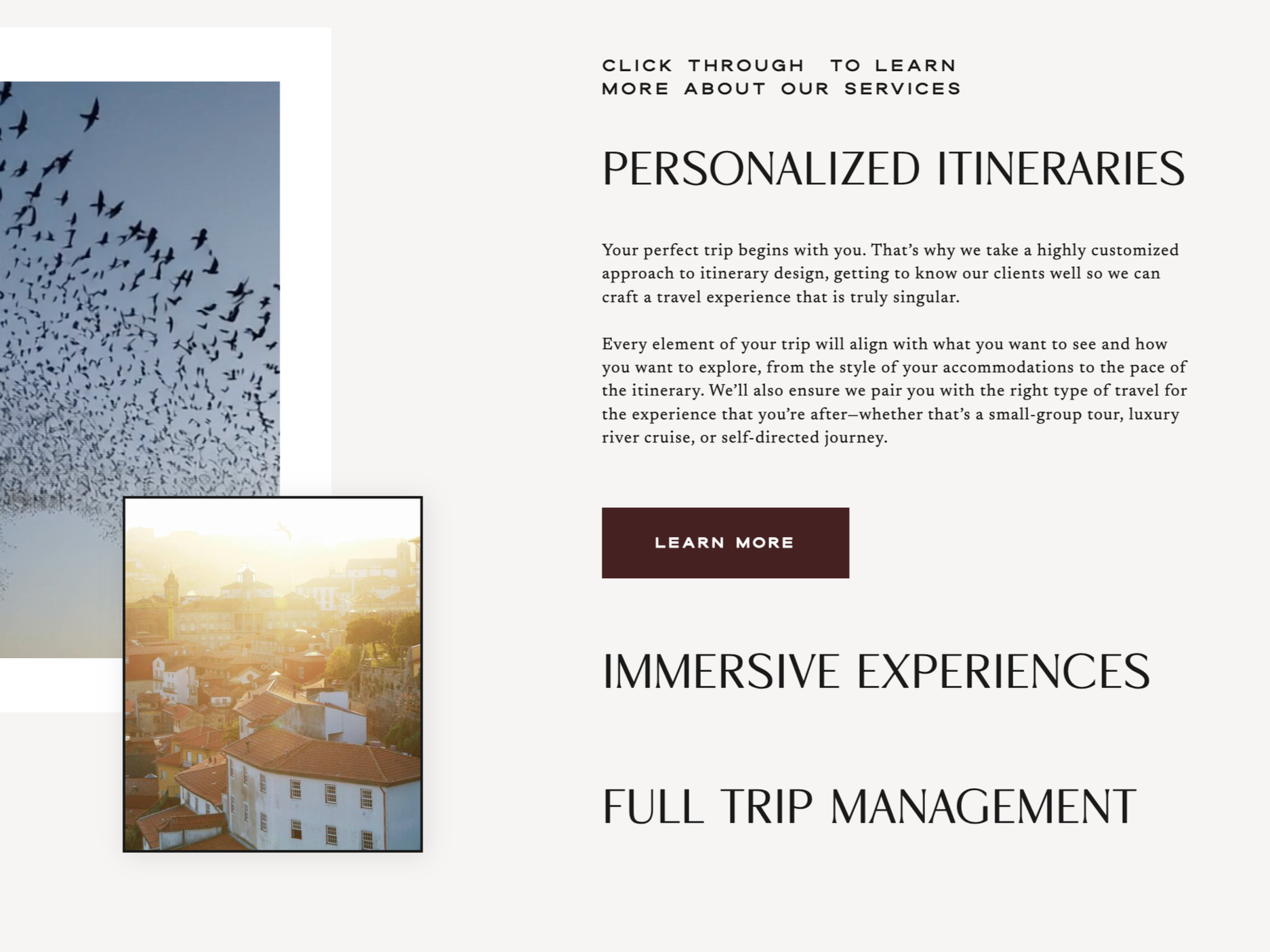
UNDERSTATED, CONFIDENT, AUTHORITATIVE
A light sans-serif at display scale doesn't announce itself; it simply takes up space and means it. There's no decorative detail to hide behind, so words have to carry the weight on their own. The warm serif body copy is where the personality comes in, which creates an editorial quality. The pairing feels like someone who has nothing to prove and knows it. Suits advisors whose brand is built around discretion and considered luxury rather than visual drama & where the experience speaks for itself.
Website: MMAARKHAM TRAVEL, Designer: Smeuse Studio
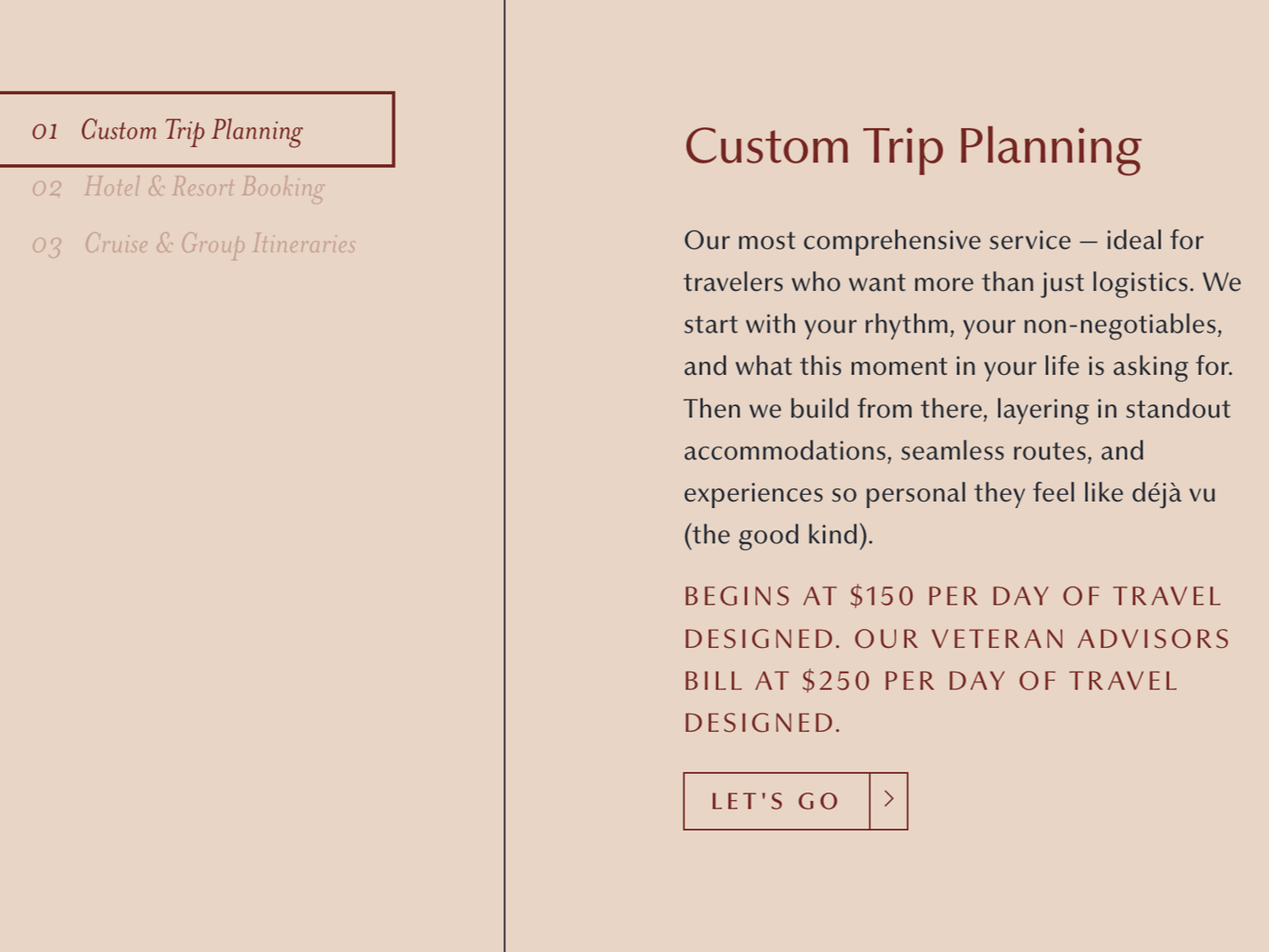
WARM, EDITORIAL, RELATIONSHIP DRIVEN
A transitional serif with moderate stroke contrast and rounded details — approachable and literary rather than dramatic. Think trusted expert, not luxury brand. The type feels like it has been around a while and knows what it's doing. Suits advisors whose clients book based on personal connection and whose brand is built more on warmth than on polish.
Website: ANTHOLOGY TRAVEL, Designer: Unknown
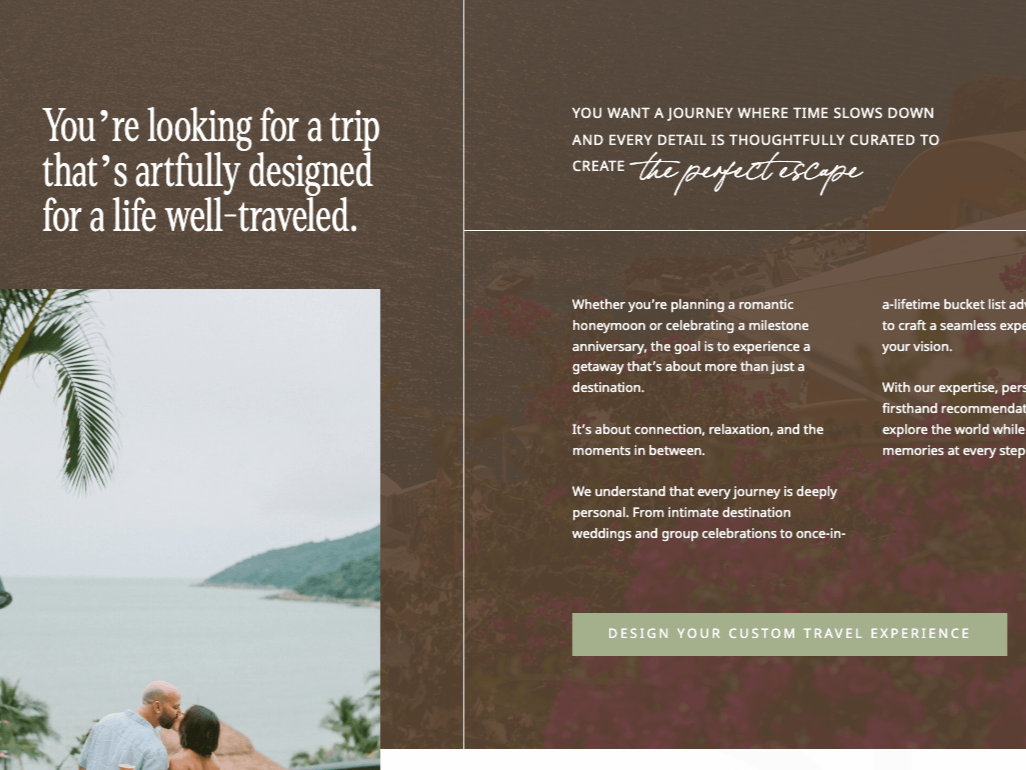
IMMERSIVE, ROMANTIC, EXPERIENTIAL
A warm serif in mixed case carries the main message; unhurried and confident, like someone who has seen a lot of the world and isn't in a rush to prove it. A script punctuates the secondary statement at just the right moment, adding a handwritten intimacy without taking over. Notice the script is an accent, not the entire personality. Three styles, one cohesive feeling. Suits advisors whose brand leans into the sensory and experiential side of travel — the mood of a place, not just the logistics of getting there.
Website: TROPICAL SUN VACATIONS, Designer: Unknown
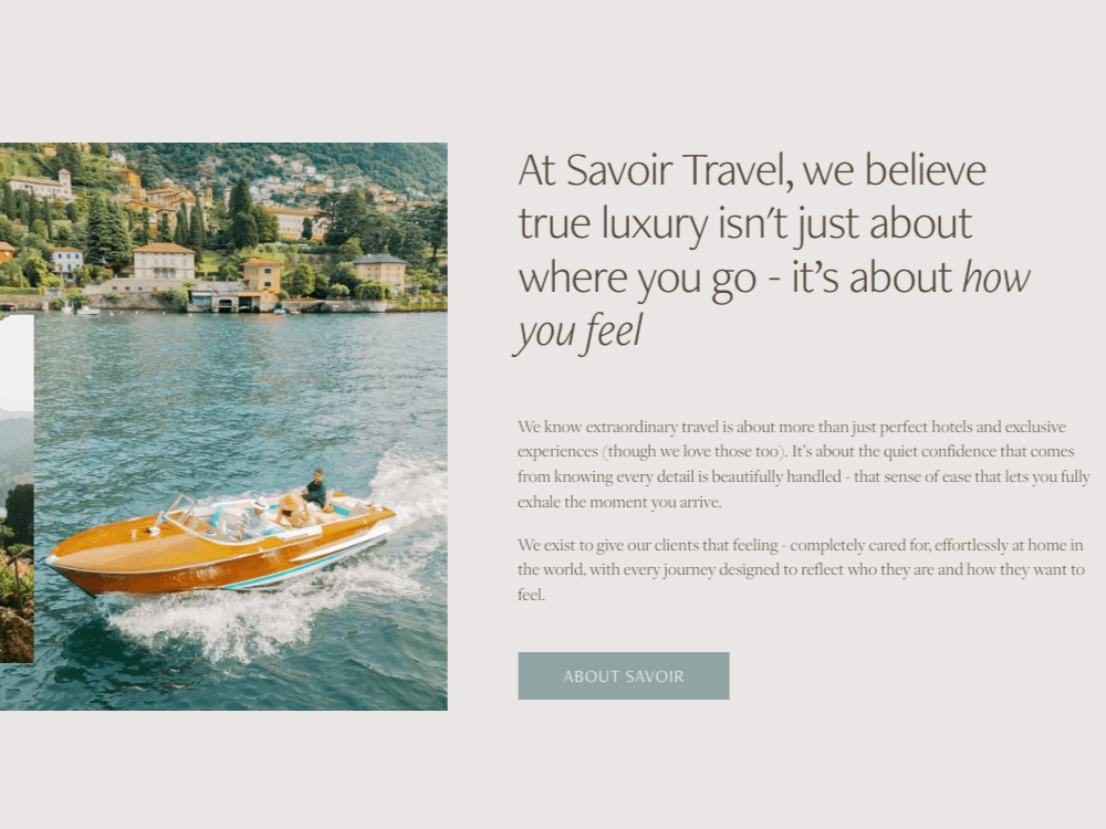
MODERN, QUIET, CONSIDERED
A very light-weight sans-serif at large display size, with an italic used deliberately for emphasis rather than decoration. The restraint is the point; nothing is trying too hard, and that reads as premium in a way that a default serif no longer does. Suits advisors whose positioning is understated luxury and whose clients value taste over drama.
Website: SAVOIR TRAVEL, Designer: Birch & Bud Design Co.
In every case, the body copy should do the opposite job to the heading without competing.
Four practical things to check right now:
Is your body copy at least 16px on desktop? If it’s smaller, visitors are working harder than they should be.
Is your line spacing at least 1.5 times the font size? Tight leading feels cramped, and people skim right past it.
Is the contrast between your heading and body obvious at a glance — in weight, style, or both?
Are you using more than two fonts? If yes, cut one unless it’s been curated strategically.
One thing worth saying clearly: font choice doesn't happen in isolation. It's part of a visual identity system, and if your colours, logo, and brand haven't been designed together with intention, even the right font will feel like a costume rather than a personality. If you're building toward a premium website and suspect your visual foundations need work first, that's a branding investment before a website.
I work in partnership with Smeuse Studio — Amandolin works with Travel Advisors who need brand identity done properly before a website project begins. If you know the brand needs sorting first, that's where I'd point you first. Let her know I sent you if I don’t connect you myself!
2) Images - The Hidden Communication Layer
A stock photo problem on Travel Advisor websites isn't really about stock photos. It's about images that communicate generic rather than specific. You can use stock photography and have a website that feels like it represents your brand and attracts the type of clients you want to work with. You can use original photography and still have a website full of images that could belong to anyone.
The question is whether an image conveys the feeling of an experience, or just the destination.
Wide landscape shots of coastlines and mountain ranges are beautiful, but they also look exactly like every other travel website. Your clients aren't buying the view from the plane. They're buying the room they're sleeping in, the restaurant they're eating at, the private villa they've been promised.
What actually works:
Interiors over landscapes
A beautifully designed hotel room, a perfectly set table, a lobby that looks like it costs what it costs. These communicate the actual thing you're selling.
Detail shots over overviews
A close shot of a handwoven textile, a plate of food that looks extraordinary, and the specific quality of light in a particular hotel room. These images say: I notice things. Which is exactly what a good Travel Advisor does.
Colour coherence
Your images need to feel like they belong in the same visual world as each other and your brand palette. Warm, earthy tones in your branding next to cool blue-toned photography create a dissonance most clients can't name but definitely feel.
What to remove
Images of people holding cocktails looking at the sea (we've all seen that one approximately ten thousand times), cruise ships photographed from the outside, anything that looks pulled directly from a resort press kit.
The test: strip your logo from the page. Could this image live on a hundred other travel websites? If yes, it's not doing enough work for your specific positioning.
A few of my favourite Stock Photo Sites
Royalty Free User Generated Content. Very informal, submitted by content creators.
Royalty Free Photographer submitted imagery and video
Editorial style, stock imagery membership
3) Layout, Whitespace & What Your Homepage Needs to Communicate
White space is not wasted space. It's what's left when you have the confidence not to fill every inch of the page. And for what it’s worth, it doesn’t need to be ‘white’.
Crowded layouts communicate scarcity thinking — the visual equivalent of cramming every offering onto a single page because you're not sure which one will land. Spacious layouts communicate that you know what matters. Less on the page means each thing that is there gets more weight.
The Homepage works best following a loose hierarchy:
Above the fold (the ‘hero’)
Hero structure: Preheader (context setter, names where your visitor already is/can also add location here). H1 (names the friction, stakes or transformation). Subheading (names the specific, invisible things you do that answer it). Call to Action button (single action).
Just below
A brief section that makes the case for working with a Travel Advisor, and specifically you. Name what you can do that a search engine or OTA cannot. Keep it specific.
Mid-page
A brief look at how working together actually works. Share your services & short process section, which leads to your Services/Work With Me page.
Toward the bottom
A blurb about you, a link to your newsletter or blog, and a final call to action.
A few things are probably on your homepage right now that might be hurting you
The rotating banner slider
A University of Notre Dame study found only 1% of visitors clicked on an auto-rotating carousel, and 84% of those clicks were on the first slide. This is a documented conversion problem, not an aesthetic preference. One image, one statement.
The embedded Instagram feed
Social feeds pull content from third-party servers, slow your website down, and redirect visitors off it. Add it to your contact page, and keep your social links in your footer.
The autoplay video hero
I love a good video banner, but it causes slow load times, and it’s often a user experience problem, especially on mobile.
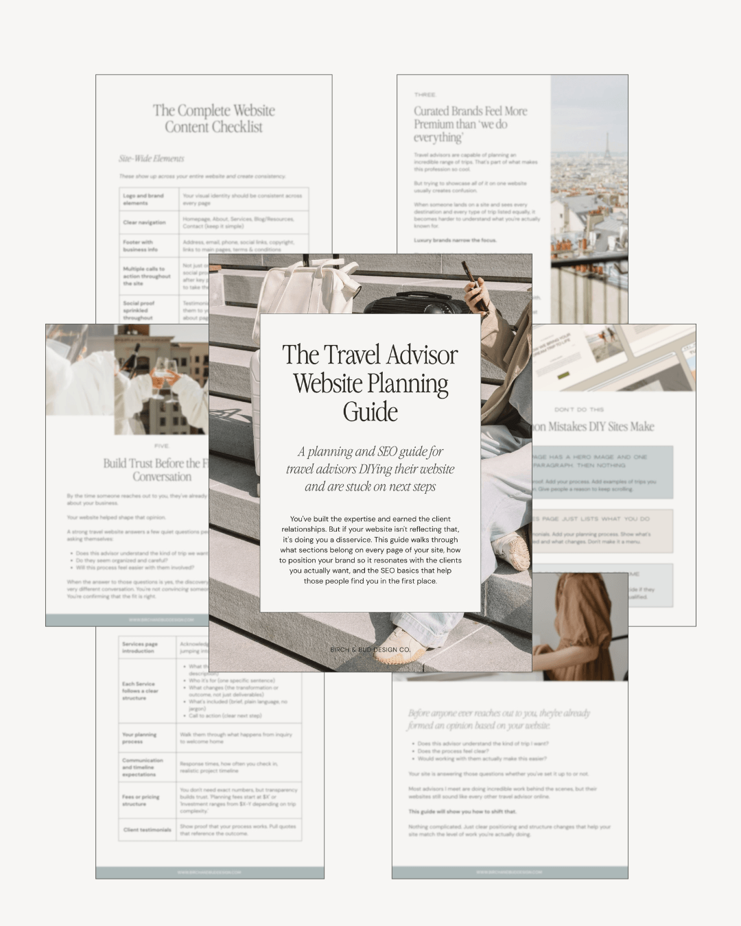
Overwhelmed?
The Website Planning Guide covers key website pages section by section, so you know exactly what to add to each page.
Page structure, how to position yourself so you don't sound like every other advisor, and SEO basics that help the right clients find you.
4) Social Proof That Converts for Luxury Clients
Generic testimonials do very little for a client evaluating a significant trip investment. 'She was wonderful to work with!' tells a high-budget client almost nothing they can actually use.
What moves this audience: specific outcomes with real detail.
Eg: “We'd been talking about a trip to Japan for years and kept putting it off because the planning felt overwhelming. Within our first call, Sarah had already asked questions no travel website had ever thought to ask us. Three weeks later we were in Kyoto with private access to a temple that had been closed to tourists for most of the year, eating at a restaurant that doesn't take public reservations, and on day eleven our teenage son told us it was the best thing our family had ever done together. I didn't know a trip could feel that personal. We're already planning the next one."
Stats and publication mentions carry weight, too. Booking volume in a specific destination type, years of experience in a particular niche, and preferred partner credentials with a specific hotel group. Concrete, specific numbers are harder to argue with than general claims about your passion for travel.
A Note on Supplier Logos
One distinction worth making on supplier and consortium logos: on the homepage, a row of logos reads as affiliation with a network many advisors share. It doesn't differentiate.
On the about page, framed as specialist credentials alongside what that access has enabled in practice, they read as earned expertise.
On the Homepage, I recommend focusing logos on press like ‘as seen in’, stats, and solid testimonials.
If you need some help crafting questions to enhance your client feedback, check out my free download, the Post-Trip Feedback Framework for Travel Advisors.
5) The Inquiry Form as a Positioning Statement
This is the section that rarely gets covered in posts about luxury website design, which is strange, because it's one of the highest-stakes elements on the page.
The questions you ask someone before they've ever spoken to you set the tone for the entire relationship. A form that asks for destination, dates, and a blank budget field is interchangeable with every other advisor's form online. It says: I need to collect information. That's fine, but it's doing the bare minimum.
Budget is worth keeping on the form, though. Used deliberately, it's one of the most effective positioning tools you have. A dropdown that starts at $15,000 or $20,000 isn't just collecting data. It's setting the standard for who this service is for. Clients self-select before you've said a word, which means the ones who do reach out already know what they're walking into. That's a very different discovery call than the one where you spend the first fifteen minutes justifying your rates to someone who found you on Google and wasn't expecting the number.
Adding considered questions alongside that does even more work. 'What kind of experience are you trying to create' or 'what's worked and what hasn't on past trips' signals that you think about the whole picture, not just the logistics. That combination of a clear price floor and thoughtful questions tells a high-budget client two things before you've ever spoken: this advisor knows her value, and cares about my trip and who she works with.
One more thing worth saying: before someone gets to the form at all, they should already have a clear enough sense of what working with you costs that the discovery call is a confirmation, not a surprise. Showing your fees openly, or at least a starting price of your packages, signals confidence, and people appreciate transparency. Clients who are surprised by your rates on a call rarely convert easily to booked trips.
6) Don’t Ignore Your About Page
Most Travel Advisors underestimate their ‘about’ page. It consistently gets more traffic than expected, because clients who are close to reaching out want to know who they're actually going to be working with. The number of websites I’ve visited lately that had no images of their staff is mind-blowing. People want to know who you are.
What it needs to do for a high-budget client:
Your real story, briefly and specifically (not a timeline of certifications — the actual why behind how you work and who you work with)
Your genuine view on what good travel planning looks like
Enough of your personality that they can decide if they like you before they reach out
The photo: it should reflect you. Not a headshot from the shoot where you wore a blazer you’d never wear in real life (No shade. We've all done the blazer shoot…and TBH, it still lives on my website… I need a new brand shoot.)
But anyway, the about page is where clients decide if they like you, and there’s no point in pretending you’re anyone other than who they will get when they work with you.
ICYMI, if you want a structured framework for what actually goes on each page, the Website Planning Guide for Travel Advisors covers this in full, page by page.
What Might Be Dating Your Website, or Giving DIY
These are the choices that signal a website hasn't been looked at in a while. Which is fair, most Travel Advisors are running a full business, and a website refresh isn't always top of the list. But clients make these reads fast.
The rotating banner slider: covered above, but it belongs here too. Documented conversion problem, not just a visual one.
The destination gallery page: a grid of beautiful travel photos with no editorial context, no client story, no point of view. It reads as a brochure. The same images with a perspective attached to each one would tell a completely different story. An alternative to this would be a blog featuring curated itineraries, destination or resort roundups for your ideal client, client experiences, etc.
Copy like 'We specialize in luxury travel to all destinations worldwide': specialize means nothing if it applies to everything. This copy actively tells clients you'll take anyone, which is the opposite signal from the one you want to be sending.
The embedded Instagram feed: covered in the layout section, but it belongs here too. Unless it’s super curated and matches your website, leave it off the homepage. You’re actively telling people to leave your website.
The contact form with a single text box: no questions, no structure. No signal that you've thought about what a good client conversation looks like before it starts.
None of these alone is the worst thing in the world, but they add up; they are simple fixes if you want to make them.
TL:DR (or FAQ)
What actually makes a luxury Travel Advisor website design feel high-end?
The collection of specific decisions all point in the same direction: warm serif (or clean sans serif) typography in headings, images that communicate experience rather than just place, spacious layout with clear hierarchy, specific social proof over generic testimonials, and copy that speaks to one type of client rather than everyone. None of these is expensive on its own. Together, they create a website that feels considered and credible.
What should a luxury Travel Advisor website include?
At minimum: a homepage that makes a specific positioning statement, an about page that lets clients decide if they like you before they reach out, a services or specialty page that explains what working together looks like (fees included), and an inquiry form with actual questions. For the full page-by-page breakdown, the Website Planning Guide for Travel Advisors covers exactly this.
How do I make my Travel Advisor website look more professional without a full redesign?
Start with typography hierarchy and body copy size. Adjust the inquiry form questions. Remove the Instagram feed if you have one. Replace any generic testimonials with outcome-specific ones. Ensure your photos are high resolution and match your visual brand aesthetic. Clean up your navigation if needed. Make it easy to contact you. Add white space. Make sure you are evident to create a connection.
What should go on each page of a Travel Advisor website?
The Website Planning Guide for Travel Advisors is the most structured answer to this. It walks through every core page and what it needs to communicate.
What's the difference between a template website and a custom travel advisor website?
A template gives you a starting point at a lower investment. A custom website is designed around your specific positioning, your clients, and how you actually work. The difference shows up in how the website performs, not just how it looks. If you're weighing your options, the platform comparison post covers what's available for Travel Advisors.
How much does a professional travel advisor website design cost?
It varies by scope, platform, and how much strategy and copy are included. The more premium your service fees and style of travel, the more you should consider investing. Overall, you need a branding foundation ($800 - $5K), website words (DIY to a copywriter as high as $5K), photography (free stock imagery to $800 brand session), and the web design (DIY to $5K for a designer).
Do I need professional brand photography for my travel advisor website?
Not immediately. Good editorial stock photography, chosen carefully and cohesively, works well while you're building toward a brand shoot. What matters more than original photography is that your images feel specific to your positioning rather than generic to the industry.
Overall, Your Website Needs To Work For You
Most of what's holding your website back from matching where your business actually is comes down to specific decisions, not a fundamental problem with the whole thing. Typography, image selection, homepage hierarchy, inquiry form structure, social proof, and the about page. Each one can be adjusted with even minor edits.
However, that said, if the foundation is genuinely not working, it's worth designing it right once rather than patching the same problems on a loop. If you've been sharing your link and feeling obviously apologetic about it, that's a clear enough signal it’s time to invest.
My custom design service is built for Travel Advisors who are ready for a website that matches where your business actually is now - or where you want it to be. If you want to talk through what that looks like for your situation, get in touch!

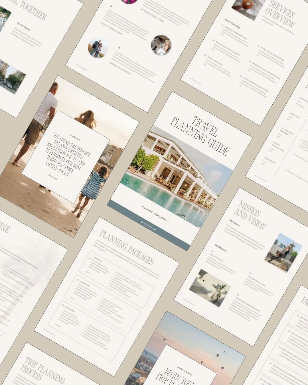






If clients land on your travel advisor site and leave without reaching out, it's almost never about design. It's the questions your copy didn't answer.